UI/UX Design Project

CNN

Redesign

  • Main Role

    UX Designer

  • Date

    November 2025

  • Duration

    10 weeks

  • Team Size

    3

image

What would news look like if it spoke Gen Z’s language?

Got just 30 seconds? Quickly know what we did!

The CNN redesign reimagines how Gen Z discovers, consumes, and interacts with news. It transforms the platform from a static, information-heavy website into an engaging, personalized, and gamified news ecosystem. This redesign bridges trusted journalism with a new era of news experiences that are intuitive, rewarding, and built for the next generation.

image

My Role

I served as the UX designer responsible for shaping the Gen Z–focused redesign of CNN’s digital experience. I led user research, identified key pain points, redesigned core flows for GenNow page and created a cohesive system that made news more interactive, intuitive, and engaging for younger audiences.

Here’s a quick summary, if you are in a hurry!

image

The Problem

CNN’s current platform feels overwhelming, static, and not aligned with how Gen Z consumes news. As a result, younger audiences struggle to find relevant stories, engage deeply, or build consistent news habits.

image

The Solution

We redesigned CNN into a clearer, more personalized, and interactive ecosystem built for Gen Z behavior. The new experience makes news easier to navigate, more engaging to explore, and more rewarding to come back to.

image
image

Still want to read more? Here you go!

Context

Redefining how news connects

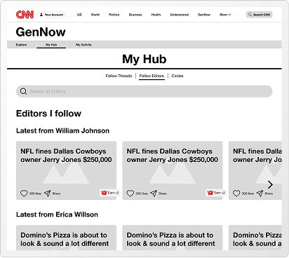
As Gen Z rewrites the rules of news consumption, CNN must evolve from a traditional publisher into an experience that matches their pace, preferences, and digital habits.

Gen Z increasingly consumes news through algorithms, creators, and short-form video. Their behaviours prioritize immediacy, selective trust, and visually-driven storytelling. This is creating a widening gap between traditional news sites and how this generation actually stays informed

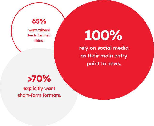
Due to this CNN risks losing relevance with Gen Z and future audiences unless it delivers an web experience that aligns with their tastes and content consumption habits. They have experienced a 50% revenue loss over the past two years as 71% of Gen Z and Millennial users now get their news from social media.

Design Framework

images

Secondary Research

Analyzed industry reports, media studies, and global news consumption data

Secondary research revealed that Gen Z gravitates toward fast, gamified, and highly personalized content. They connect most deeply with brands that create community and deliver information in short, engaging formats.

  • 60%

    increase in retention and engagement through gamified learning

  • 61%

    of Gen Z preferring videos under 60 seconds

  • 80%

    are willing to share personal data for a more personalized experience

  • 85%

    of Gen Z respondents believe it’s important for brands to create a sense of community.

image

Primary Research

We conducted 11 interviews and a survey with 40+ responses with current and aspiring art/design students to gain deeper insights and uncover the pain points and opportunities in building a portfolio.

Persona

Meet Maya Johnson: The Efficient Curator

BREAKING NEWS

A social-first news consumer who skims headlines through TikTok, Instagram, and Twitter. Maya expects news to be personalized, visual, and swipeable like a feed, not a website.

Habits:

  • Discovers news through social media, then verifies on trusted sources.

  • Engages with videos, bold summaries, and save/share features.

  • Prefers “For You” feeds that adapt to interests

Pain Points:

  • Too much text, poor hierarchy, irrelevant recommendations.

  • Takes too many clicks to find what matters.

image

Looking for ways to not have FOMO (feeling of missing out) and stay relevant within her interests.

Needs & Opportunities:

  • Short video explainers and quick-view cards.

  • Personalized onboarding to tailor feeds.

  • Quick visual cues like read-time tags and “similar to this” suggestions.

“I usually only dive deeper if a news interest me. I want something scanable at first”

Key Insights that informed my design decisions

Information Overload, Low Retention

The homepage feels dense and text-heavy, overwhelming younger users accustomed to visual storytelling.

Limited Content Personalisation

Content isn’t tailored to user interests or browsing behavior.

Passive Consumption, No Interaction

Users prefers two-way engagement where they earn value from interacting with content.

Outdated visuals & Content Language

Gen Z prefers short-formed and snackable formats that blend credibility with approachability. .

Laying the Foundation

Using insights from primary and secondary research, I restructured the site into a streamlined information architecture that aligns user goals with content hierarchy, improving discoverability across key sections.

images
image

Flows and Wireframes

I drew out our initial ideas taking inspiration from the exsisitng CNN website and other social media platforms. These ideas turned out to be my foundation bricks for the rest of our UI development.

image
image
image
image
image
image
image
image
image
image

User Testing

6 Gen Z users were recruited who represent the target audience of CNN GenNow.

Participants were selected based on:

  • Age range between 19 and 24 years

  • Regular users of digital media and social platforms

  • Varied familiarity with traditional news sites (CNN, BBC, etc.)

  • No prior exposure to the GenNow prototype or design

Moderated Testing

Guided the participant through tasks in real time, to understand navigation flow and content understanding.

Think-aloud protocol

Encouraging participants to verbalize their thought process as they navigated the prototype.

images
images
images
images

Final Prototype

Using insights from user testing, we implemented the changes and created our high fidelity prototypes.

image

Coachmarks Onboarding

Allowing users to understand how the gamification system with GenNow works and how they can interact with elements within the page.

image

Explore with News Cards

Swipe through bite-sized story cards that summarize key articles. Designed for quick, meaningful browsing.

image

Explore Tags

Track developing stories or trending conversations that interest you.

image

Explore Editors

Discover and follow youth editors whose takes resonate with you. Curated threads keep your feed fresh and relevant.

image

Join Circles

Exclusive community spaces where active users can join topic-based groups, discuss ideas, and share opinions once they’ve earned enough points.

Gamification System

Earn + 5 points

with every quiz question answered right

images

Earn + 1 point

with every like and share of an article

images

Earn + 2 points

by following a tag of your choice

images

Earn + 2 points

by following a editor of your choice

images

Join a circle

of your choice with the points collected.

images

Learnings

No project is ever easy. Each challenge pushes you, teaches you, and transforms you. Here’s what Setu taught me. Lessons I couldn’t have learned any other way.

images

Challenge 1: Balancing Credibility With Engagement

Coming in, I assumed news design had to be either “serious and credible” or “fun and Gen-Z catered.

Learning

I learned that credibility and engagement aren’t opposites. With the right information architecture, interaction design, and content hierarchy, you can make news trustworthy and scroll-worthy without diluting journalistic integrity.

images

Challenge 2: : Designing for Attention, Not Assumption

I initially relied on assumptions about how Gen Z consumes news. Fast, visual, swipeable, without understanding the deeper psychological patterns.

Learning

Grounding decisions in behavioral insights, not trends, helped me design features that align with real motivations, not just “short attention spans.”

images

Challenge 3: Untangling Information Architecture

CNN is a massive content universe, and my first instinct was to “fix everything at once,” which only led to cluttered flows and overthinking.

Learning

Breaking the ecosystem into modular, purpose-driven sections (Home, GenNow, Watch) taught me that good IA is about clarity, prioritization, and giving every page a job(not cramming everything into one screen).

If You Liked This, You’ll Love These

If You Liked This, You’ll Love These